Zumiez, founded in 1978 by Thomas Campion and Gary Haakenson, is an American multinational clothing retailer.


The company offers a breadth of merchandise at its stores, which includes apparel, footwear, equipment, and accessories, that cater specifically to teens and young adults that enjoy an “organized chaos” lifestyle.







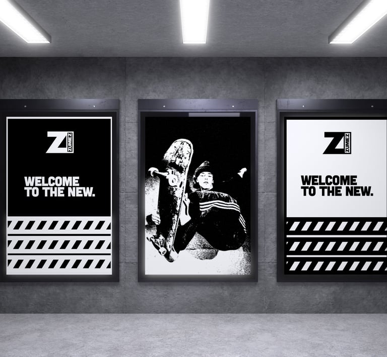
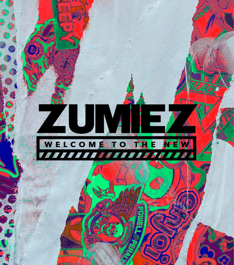
Embrace their inhouse brands and create content all around the house of brands.
The second, allow for the company to make its own clothing brand in house, promoting Zumiez itself and not promoting other brands.
Finally, promote Zumiez in a way that does not necessarily try to fit in. Make the brand seem out of place when it wants to be a trend.
Solutions:
Logo Improvements:
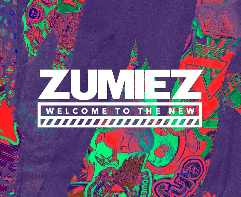
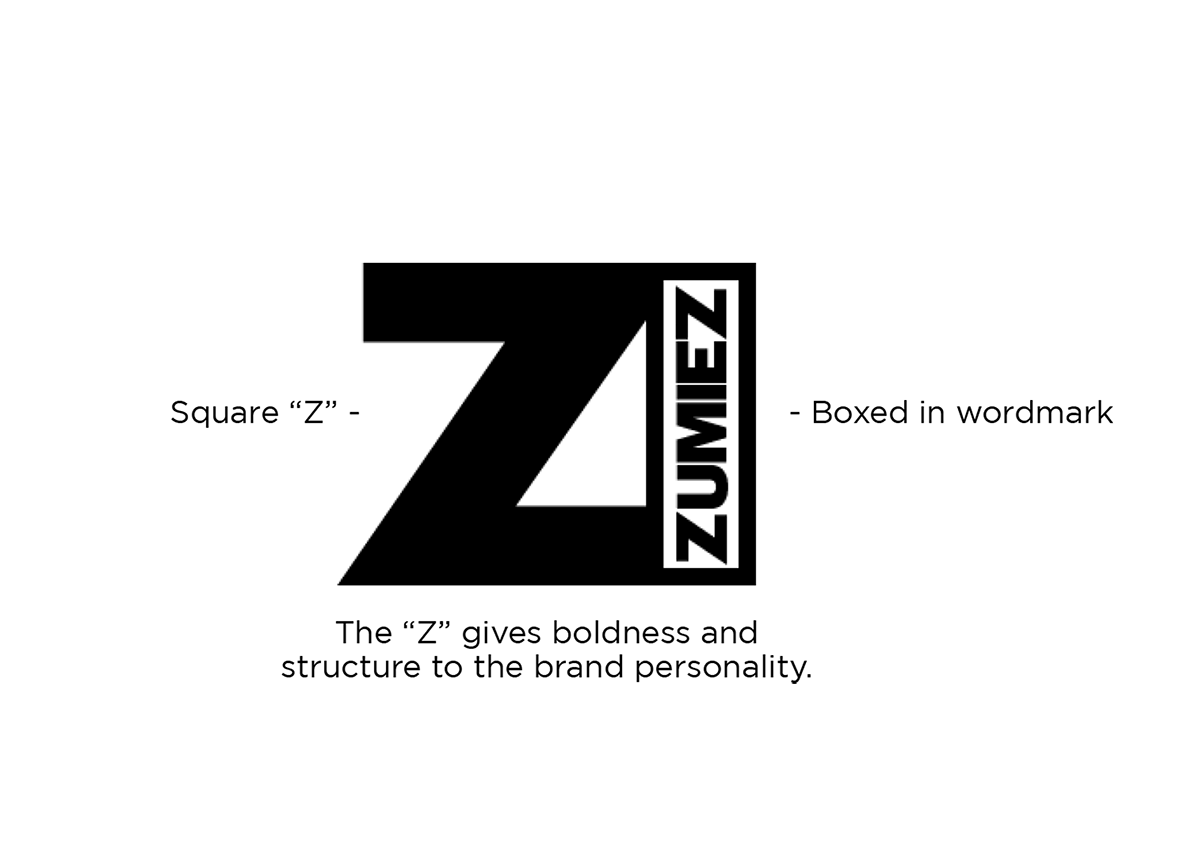
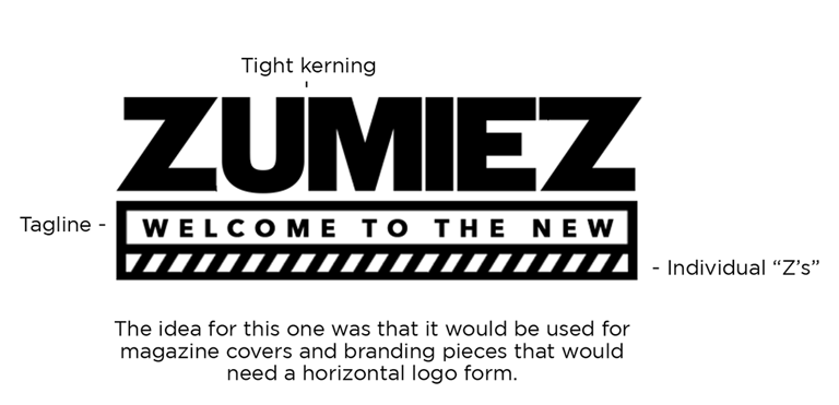
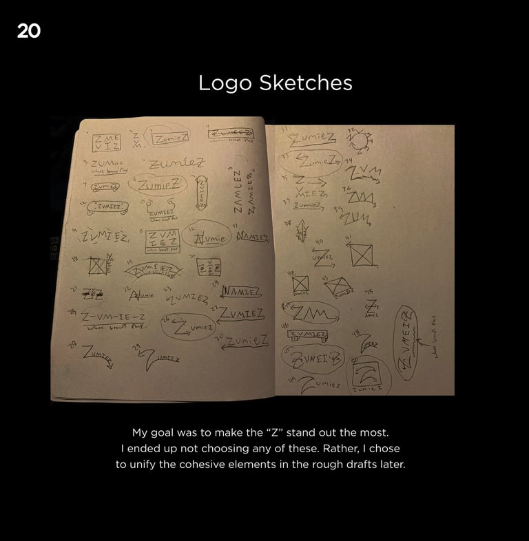
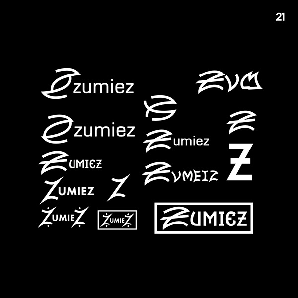
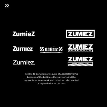
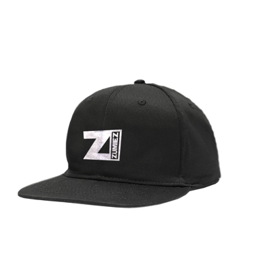
The logo works well on most things, but the logo is overly simple. The logo kerning may represent how reckless they want to be, but they don’t have a tagline so that gets lost. and Finally, changing the typeface.
I chose to go with Gotham bold and Cubano as my typography. The two fonts complement each other. Cubano is all caps and bold and Gotham is bold but Gotham is used, being more legible for body copy.
My vision for the brand's voice is pretty much the same as it is now. The voice should be consistent and reflect the brand as a whole. Zumiez’s voice should be outgoing and different.
Typography

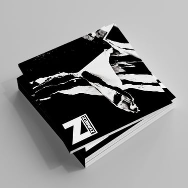
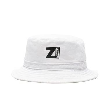
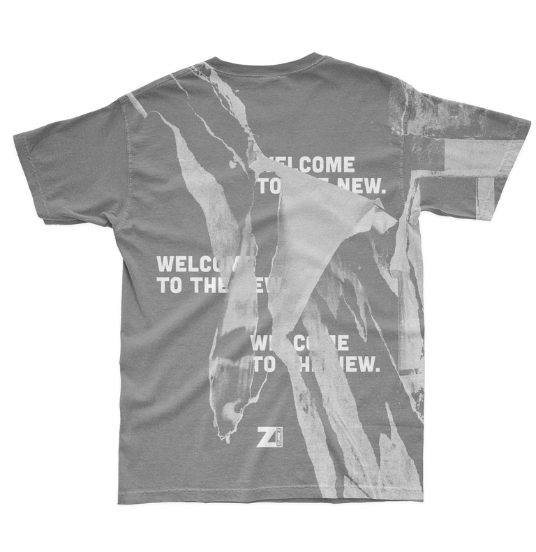
Conclusion:
The goal of this rebrand/campaign was to broaden the spectrum of the different types of consumers that would engage with and identify with Zumiez.
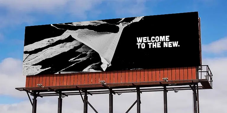
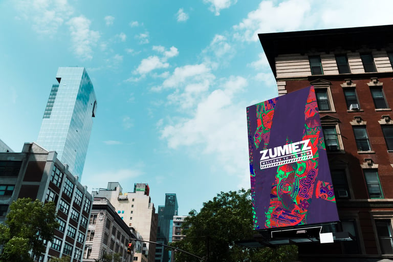
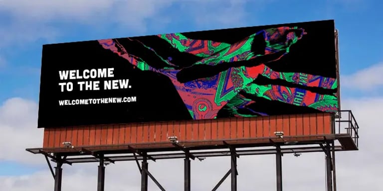
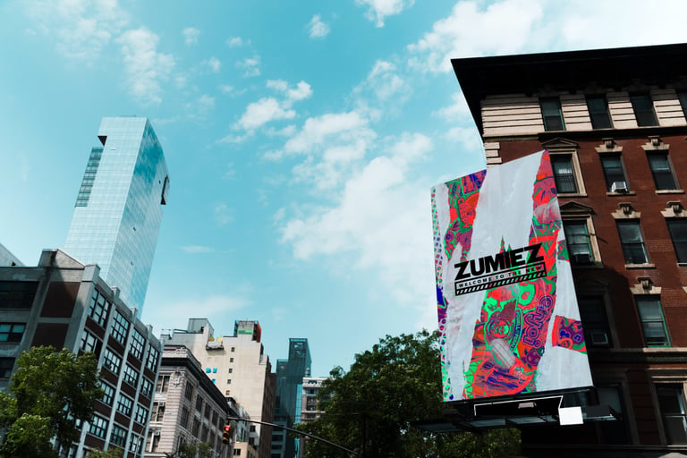
“Welcome to the new” is centered on how Zumiez is making changes and how that change would and will affect people. The opportunity for growth within this brand is significant given that they have a hold on most of the skate and snow markets.
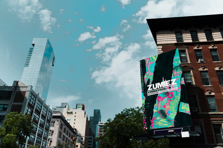
The idea with the billboards is a strategy called word of mouth. The idea is that people would spread this campaign through one another in conversation, and eventually, this campaign would become a widespread phenomenon. It would all start from billboards and transition into posters, merch, and so on.

